Five Tools For Design
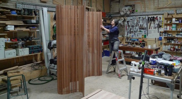
Laura McCusker with the Barcode Screen she designed 20 years ago and still makes to order. Photo: Peter Howard
Words: Laura McCusker
The theme ‘tools for design’* has given me the opportunity to think on how I design and make. I’ve brought it down to five areas that influence me. These basically look at designing with and without restrictions, the way my work evolves, the people I work with and the ethos I try to maintain.
1. The blank canvas
Exhibitions: the freedoms, challenges and rewards. Exhibition work is great, when I was starting out I remember being so honoured and at the same time completely intimidated when I was invited to be part of a small local exhibition. The freedom to design without a client in mind, or a budget, brief or material even sounds like a gift. It certainly gives you the opportunity to experiment with new ideas that may or may not work out, and sometimes it’s good to allow yourself the freedom to play.
One of my favourite pieces which I’ve been making for 20 years is the Barcode Screen. This was imagined while on holiday, somewhere between staring at the barcode on a cereal packet and watching the light play as you drive past timber plantations and stands of gum trees. An invitation to exhibit meant that I could make these ideas a reality, take time to nut out the practicalities and see if it would literally stand up.
Exhibitions are great for creativity, publicity, engagement and connection to community and sometimes if you’re really lucky there’s even prize money.
2. Please fence me in
Boundaries. Having just waxed lyrical about the wonderful freedoms that exhibition work affords, I have to admit that I actually prefer some boundaries. When I was doing my education degree I came across a study that was trying to understand creative thinking, and work out if it was possible to teach creativity.
A bunch of kids were divided into two groups. One group was given an unlimited supply of Lego of all the colours, shapes and over-engineered little components. They told these kids to build something really amazing. They had all the time they needed
to do this. No boundaries, no rules, just go. The other group was given an unlimited supply of white blocks only.
Presumably you can guess what happened. The kids with limitations blew the others out of the water when it came to designing and building something creative.

The I-Beam Bench was designed for the Tasmanian Museum and Art Gallery’s need for public seating with a brief to reference the industrial history of the old Bond Store building. Winner of Clarence City Prize for Excellence in Furniture Design, 2013. Photo: Peter Howard
Boundaries for us can be budget, time, materials and function. The I-Beam Bench was designed to fill the brief from Tasmanian Museum and Art Gallery’s need for public seating. They asked for a piece that drew on the industrial history of the old Bond Store building. The shape references the ubiquitous steel I-beams, but this one is made from eucalypt.
I wanted to highlight the beauty of industrial engineering forms, elevate Tasmanian oak from a structural timber very rarely used in fine furniture and at the same time provide robust seating which could withstand the wear and tear of high volume use. To emphasise the shape, I painted the endgrain with a bright blue signwriters paint which is the colour of the graffiti painted on the walls from the early 1800s. There were about 50 benches in total for that job as well as another version for the other museum buildings.
The bar tables and benches I designed for MONA are another design that went on to have a life beyond the original commission, in domestic and residential as well as corporate settings such as the courtyard at Design Tasmania.
3. Rinse and repeat
Repetition. Repetition is practice, practice makes (closer to) perfect. You make money on the repeats and that repays you for the original investments into your research and development, but more importantly, repetition is where you adjust and refine.

Rinse and repeat: Repetition is practice and practice makes (closer to) perfect.’
While we don’t do production pieces per se, our pieces do evolve over time as we repeat designs and adjust forms to suit different client needs. Each time we make a version, our fabrication process improves. The first Frank’s Table was small and made for a tiny converted barn in Hobart and used one of the original beams as the top. We’ve made numerous versions of this table, and each one is slightly different. This not only keeps us interested but we keep learning. Each one comes from the same design concept and joinery detail, but we’re able to streamline our processes and in theory learn from past mistakes.
Many different versions have been made of the original Frank’s Table. This one is made from Eucalyptus regnans
and measures 3200 x 1680 x 720mm. Photo: Peter Howard
If you imagine a line or a spectrum with boredom at one end and stress at the other, in theory there’s a sweet spot somewhere in the middle. That’s where the good work lives. The jobs that are challenging and fulfilling but you know that you’ve got the skills, knowledge and capacity to deliver. Repetition helps us find this zone.
4. Other people
Community. Collaboration is a term that is in danger of being overused – along with ‘bespoke’, ‘tailored’ and ‘crafted’ – but in my experience when it is done right the whole is definitely greater than the sum of the parts.
Genuine collaboration is a two-way street with egos put aside. Some of the most exciting and terrifying projects we’ve worked on over the last ten years or so have come through collaborations with architects, artists, metalworkers, engineers and scientists. It’s always fun to play with others – as long as there’s a no dickhead rule. This works quite well in Tasmania – because it’s such a small community, word travels fast. Small communities encourage you to be the best version of yourself which suits me just fine.
5. Mingei movement
Mingei is a Japanese folk art movement that developed in the 1920s and 30s. Its philosophical pillar is ‘hand-crafted art of ordinary people’ and it’s about recognising the beauty in everyday ordinary and utilitarian objects created by nameless and unknown craftsmen.

The Cheese Trolley for The Source restaurant at MONA had a detailed brief as the cheese has to be kept moist but not damp. It had to have just the right amount of ventilation, have a waterproof drip tray to collect condensation, drawers for cutlery and plates as well as full extension cutting boards. Food grade functionality was essential and aesthetics no less so. Photo by Rosie Hastie
There are some caveats here. There’s anonymous and anonymous – clearly I’m not hiding in a cave on some remote mountain. And there’s quantity and quantity. I’m talking quantity on the human scale: muscle memory and production process refinement.
In terms of everyday there’s inexpensive and inexpensive. Too cheap and the object/materials aren’t respected – to many people perceived value is inextricably linked to cost. There should be a fair price for the work and materials, but the client shouldn’t have pay for your excesses.
Everyone should be able to have beautiful functional objects for use; egalitarian rather than exclusive. Pieces that wear well and look better after years of use. Finishes and materials that age ensure longevity. Increase rather than decrease value. Like favourite old jeans, worn-in and loved leather boots, timber with the patina of time.
Things should be repairable – this means by me or someone else. The emotional attachment needs to be established first but repairs and maintenance needs to be considered at initial fabrication design stage. It’s important to me that I don’t make something that can’t be opened up, pulled apart and put back together.

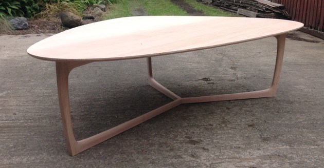
Laura McCusker’s LXN round table in oxidised eucalypt 1400 dia x 720mm. Photo: Peter Whyte
This is also why I use simple, old fashioned hand applied finishes. They’re not as high gloss or bomb proof as some other finishes but, as I mentioned, that’s not what I’m after, but nor should people be afraid to use my pieces everyday. Use coasters if you like them, but they’re not essential. The marks of daily use tell a story and stories are important.
The Mingei philosophy applies to objects that are representative of the place in which they were produced. Globalisation and homogenisation of design has meant there’s been a loss of the vernacular.
I live in the real world, a world of Instagram and sometimes almost too much visual stimulation and inspiration. I tackle this by using local materials (where possible) for local people (mostly).
In conclusion, I’ve tried to give you an insight into some of the tools that I use when designing, for me it’s mostly about authenticity and differentiation. There needs to be a point of difference. The piece needs to do its job well, age with grace and be respectful of the materials it’s made from.
This is an abridged version of the presentation given by Laura McCusker given at AWR L!VE in Sydney, August 2018.
Laura McCusker was profiled in AWR#92. She lives and works as a furniture designer maker in Hobart, Tasmania. Learn more about Laura at www.lauramccusker.com


